
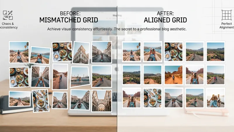
Mismatched card heights in a Divi grid are almost always one setting away from fixed. Aspect Ratio sets the container shape, Object Fit: Cover fills it without distortion, and every card in the grid lines up.
Nothing is re-encoded when you do this. Only the rendered output changes — the file in your Media Library stays untouched. Which means you can change your mind about ratios without re-uploading anything.
TL;DR: Set Design > Sizing > Aspect Ratio on the image (or Design > Image > Sizing when it's a sub-element), then set Object Fit: Cover under Framing, then adjust Object Position if the crop cuts the wrong part. Use 3:2 or 4:3 as a safe default for blogs, 1:1 or 4:5 for products. Set it inside the loop template and every card inherits it.
Where the Settings Live
| Context | Path |
|---|---|
| Standalone Image module (including inside a loop template) | Design > Sizing > Aspect Ratio |
| Image as a sub-element (e.g. Portfolio) | Design > Image > Sizing |
| Crop behaviour | Design > Image > Framing → Object Fit, Object Position |
| Woo Products module | Design tab → Image group → Sizing → Aspect Ratio |
The field takes a width-to-height proportion and holds it as the element scales. Width changes across breakpoints; height follows the ratio rather than whatever the image file happens to be.
Pick the Ratio for the Content Type
Don't use one ratio everywhere out of tidiness. Blog, portfolio and product grids have genuinely different needs.
Blog grids
- 3:2 — the default for general editorial blogs, and the safest starting point
- 4:3 — when cards carry a title, metadata and excerpt beneath the image
- 4:5 — food, lifestyle, fashion, photography
- 1:1 — social-style grids, design roundups, mostly square graphics
- 16:9 — video-heavy blogs and tutorials, for a thumbnail feel
Portfolio grids
- Graphic design, UX, branding, web design → 3:2 or 4:3
- Fashion and portrait photography → 4:5 or 2:3
- Landscape and architecture → 3:2 or 16:9
- Print and publication design → 4:5 or 3:4
- Mixed-orientation portfolios → 1:1
- Video-first portfolios → 16:9
WooCommerce product grids
- 1:1 — electronics, home goods, books, accessories, white-background catalog shots
- 4:5 — apparel, fashion, beauty, taller product photography
- 3:4 — shoes, bags, bottles, packaged goods
- 3:2 — wide lifestyle shots, bundles, furniture, horizontal compositions
Framing: Object Fit and Object Position
Aspect Ratio alone will stretch images. Object Fit: Cover is the other half — it scales the image proportionally to fill the frame and crops the overflow instead of distorting it. If your images look squashed after setting a ratio, this is the setting you missed.
Object Position then decides which region survives the crop:
- Top Center — faces and detail near the top; right for headshot-heavy contributor blogs
- Center — balanced mockups, branding work, centred dishes
- Bottom Center — interiors, architecture, product scenes weighted low
The short version: Aspect Ratio sets the container shape. Image Framing controls the crop.
The Four-Step Workflow
- Pick a ratio suited to the content type.
- Apply it to the image or the image area within the card.
- Set Object Fit: Cover so it fills without distortion.
- Adjust Object Position if the crop needs a different anchor.
For a blog grid: open the loop template, select the Image module rendering the featured image, then Design > Sizing > Aspect Ratio. Every repeated post card inherits it.
For a portfolio grid: same loop workflow. With the Portfolio module instead, use Design > Image > Sizing and set the anchor under Design > Image > Framing.
For a product grid: set the ratio on the looping Image module for full card control — image, title, price, rating, badge, button, spacing, hover states. Or use the Woo Products module for a faster grid with one shared image shape.
One thing to watch with the Loop Builder: if your loop renders the image as a background image on a Column or Group rather than an Image module, apply the Aspect Ratio to that container instead. And Object Position is shared across all cards, so pick the anchor that protects the majority and fix outliers at the source image.
The Product Grid Trap
Here's where a tight crop actually costs money. On a product grid, cropping can remove the decisive detail — the zipper pull, the heel shape, the watch face, the bottle cap, the label, a stitched seam, the product edge. Those details are frequently the reason someone buys.
The proper fix is prepping source images with padding so there's room to crop. Where a reshoot isn't feasible, Divi AI's "Expand and Fill" can extend the canvas around a product so it fits a new ratio without cutting the subject. Save the corrected file back to the Media Library and every grid using it improves at once.
That's genuinely one of the better uses of Divi AI — a boring, mechanical job that would otherwise mean a photographer.
My Take: Fix the Image, Not the Grid
Here's my one strong opinion: Object Position is a rule for the whole grid, not a tool for fixing individual images — and treating it as the latter is how grids rot.
I've built over 100 Divi sites and this is the most common self-inflicted grid problem I see. One product photo is framed badly, so someone overrides Object Position on that card. Then another, and another. Six months later the loop template's setting is meaningless because nine cards override it, and nobody can tell which values are intentional.
The discipline: choose the anchor that protects the majority, then repair outliers at the source image. Re-crop the file, re-upload it, done. It takes four minutes and it fixes the image everywhere it appears on the site — including places you forgot about, like the related-posts widget and the social preview.
The corollary: one ratio per grid, always. Mixing ratios inside a single grid reintroduces exactly the inconsistency you set the ratio to solve. Different grids can use different ratios. The same grid cannot.
And check responsive views before you sign off. A ratio that reads beautifully in a three-column desktop grid can be far too tall in a single column on a phone, which is a mistake you only see if you look — the desktop preview will happily lie to you.
Save It as a Preset
Once ratio, framing, border and shadow are dialled in, save the combination as an Image Option Group Preset. Now the next grid takes one click instead of four settings, and changing the treatment site-wide is one edit. Same mechanism as reusable border and shadow presets.
The related trick worth knowing: these same two controls drive some genuinely nice hover effects using aspect ratio and framing — animating Object Position on hover gives you an image pan with no custom CSS.
Straight Answers
Where is the Aspect Ratio setting? Design > Sizing > Aspect Ratio for a standalone Image module; Design > Image > Sizing when the image is a sub-element.
Does it change the original file? No. Only the rendered output changes; the Media Library file is untouched.
Why do images look stretched? Object Fit isn't set to Cover. Aspect Ratio shapes the container; Cover fills it without distortion.
Best ratio for a blog grid? 3:2 as a default. 4:3 with title and excerpt, 4:5 for lifestyle, 16:9 for video-heavy.
Best ratio for WooCommerce? 1:1 for catalog shots, 4:5 for apparel, 3:4 for shoes and bottles, 3:2 for wide lifestyle.
How do you apply it to a whole dynamic grid? Set it once on the image in the loop template. Use the container instead if the image is a background image.
The Last Word
Two settings — Aspect Ratio and Object Fit: Cover — fix the single most visible flaw in most Divi grids. Set them in the loop template, pick the ratio that suits the content, and anchor the crop for the majority.
Then leave it alone and fix bad images at the source. That's the part that keeps the grid clean twelve months from now.
If your product grid is cropping the one detail customers actually look at, I can sort the ratios and the source files — usually in less time than it takes to argue about which ratio is best.
This is a summary of Elegant Themes' original post, "How To Build Better Blog, Portfolio, And Product Grids With Aspect Ratio In Divi 5". All credit for the original content goes to Elegant Themes.