
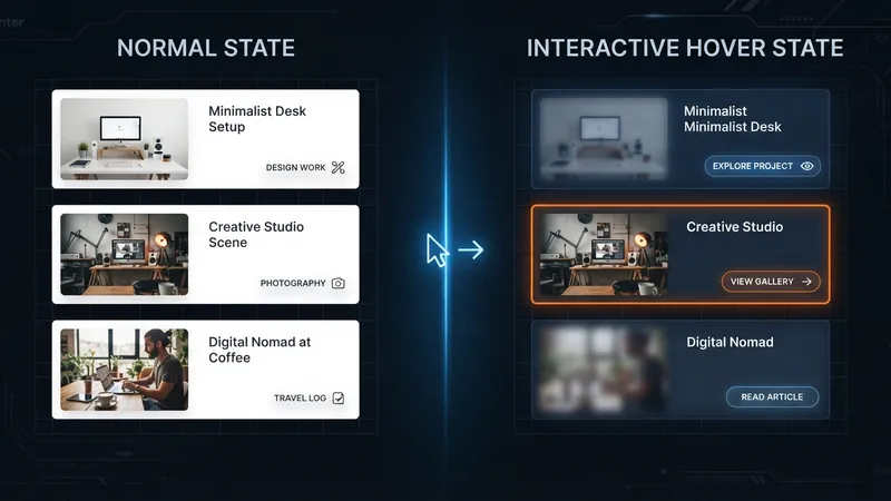
Aspect Ratio and Image Framing aren't just layout tools. Because Divi 5 animates them between normal and hover states, they give you five genuinely good hover effects with zero custom CSS.
The mechanism is simple: set a value on the element's normal state, set a different value on the hover state, and control the animation under Advanced > Transitions.
TL;DR: Animate Aspect Ratio to change a frame's shape on hover, Object Position to pan the image inside a fixed frame, and Transform Scale inside an overflow-hidden Group for a contained zoom. Use ~800ms for image effects and ~300ms for buttons. Five recipes with exact values below.
The Two Controls Doing the Work
Aspect Ratio sets the container's shape. Object Fit decides how the image fills that shape — Cover is the one you want, since it scales proportionally and crops the overflow instead of stretching. Object Position then chooses which region of the image survives the crop, using X and Y percentages.
Animate the ratio and the frame changes shape. Animate the position and the image pans inside a frame that doesn't move. Those two sentences are the entire toolkit.
If you're new to these settings, the layout groundwork is in building better grids with Aspect Ratio. Set the grid up properly first, then add hover behaviour on top.
Set Your Transitions First
Every effect below depends on Advanced > Transitions on the element:
- Transition Duration — how long the animation runs
- Transition Timing Function — the easing curve
| Effect type | Duration | Timing |
|---|---|---|
| Image drift and reveal | ~800ms | Ease-In-Out or Ease-Out |
| Person / portrait pan | ~600ms | Ease-In-Out |
| Buttons | ~300ms | Ease-In-Out |
That 300ms figure for buttons matters more than it looks. An 800ms button feels broken — the user has already moved on. An 800ms image pan feels expensive.
Effect 1: Focal Glide
A slow horizontal pan across a wide image. Good for landscape photography, architecture and hero cards.
- Set the image Aspect Ratio to 16:9.
- Set Object Fit to Cover.
- Set Object Position: X 0%, Y 50%.
- On the hover state, set Object Position X to 80%.
- Transitions: 800ms, Ease-In-Out.
The frame never moves. The image slides behind it.
Effect 2: Subject Reveal
The frame grows taller on hover while the crop anchor drops, revealing more of the lower part of the image. Strong on portraits, product shots and editorial cards.
- Base Aspect Ratio: 4:2.2 (a letterbox crop).
- Hover Aspect Ratio: 4:3.
- Base Object Position: X 50%, Y 0%.
- Hover Object Position: Y 85%.
- Transitions: 800ms, Ease-Out.
Two properties animating together — shape and anchor — is what makes this read as a reveal rather than a resize.
Effect 3: Button Morph
Aspect Ratio on a button, which sounds wrong and works well.
- Set button Height to 50px.
- Set Aspect Ratio to 3:1 — that gives a 150px width.
- On hover, set Aspect Ratio to 5:1 — 250px.
- Transitions: 300ms, Ease-In-Out.
The button widens smoothly on hover. Circle-to-pill variation: base 1:1 (a 50px circle), hover 3:1 (a 150px pill). Excellent for icon buttons that expand to reveal a label.
Effect 4: Contained Zoom
The classic image zoom, done properly. This is the one people usually reach for custom CSS to build.
- Wrap the image in a Group module and set the Group's Aspect Ratio to 4:3.
- On the Group, go to Advanced > Visibility and set Horizontal Overflow and Vertical Overflow to Hidden.
- Set the inner Image Width to 100% and Object Fit to Cover.
- On the Image's hover state, set Design > Transform > Scale to 110%.
- Transitions: 800ms, Ease-In-Out.
The debug note that saves an hour: if the zoom spills past the container, Overflow Hidden is on the wrong element. It has to be on the Group, not the Image. Every time I've seen this effect fail, that was why.
Effect 5: Spotlight Pan
Built on the Person module — a portrait that desaturates until you hover it.
- Aspect Ratio: 4:5. Object Fit: Cover.
- Object Position: X 73%, Y 50%.
- Filters: Saturation 0%, Brightness 90%.
- On hover: Object Position X 70%, Saturation 100%, Brightness 100%.
- Transitions: 600ms, Ease-In-Out.
That three-percent shift in X is doing something subtle and worth understanding — it's just enough movement to feel alive without looking like the photo jumped. The colour returning is the headline; the pan is the thing that makes it feel handmade.
Pair these with a consistent image treatment preset and the whole grid behaves the same way without you configuring each card.
My Take: One Hover Effect per Page
Here's my one strong opinion: a page should have exactly one hover effect, and every card on it should use the same one.
I've built over 100 Divi sites and mixed hover behaviour is the fastest way to make a well-designed page feel cheap. Blog cards that zoom, team cards that pan, portfolio cards that morph — each effect is fine on its own, and together they read as a demo reel rather than a website.
There's a practical reason beyond taste. Hover effects are learned. When every card behaves identically, the second card teaches the user nothing new and they stop paying attention to the interface and start paying attention to the content. That's the goal. When each card surprises them, the interface stays foreground forever.
So pick one. Focal Glide for a photography site, Contained Zoom for a blog, Subject Reveal for a portfolio. Use it everywhere images are clickable, and use nothing on images that aren't — because a hover effect on a non-clickable image is a lie about interactivity.
The exception is buttons. Buttons get their own 300ms treatment, and that's fine, because nobody confuses a button for a card.
Two Things to Check Before Shipping
Touch devices don't hover. Every one of these effects degrades to "nothing happens," which is acceptable — but make sure the non-hover state is the good state. A Spotlight Pan that sits permanently at 0% saturation on mobile means your team page is greyscale for half your visitors.
Reduced motion. Users who've asked their OS to reduce animation should get less of it. An 800ms pan is exactly the kind of thing that setting exists for.
Straight Answers
Can you animate Aspect Ratio on hover? Yes — set one ratio on the normal state and another on hover. Divi animates between them.
Where do you set transition speed? Advanced > Transitions, using Transition Duration and Transition Timing Function.
Best duration for image hovers? Around 800ms for image drift and reveals; around 300ms for buttons.
Why does contained zoom spill out? Horizontal and Vertical Overflow must be Hidden on the Group, not the Image module.
Can you animate Object Position? Yes — changing X or Y on hover pans the image inside a fixed frame.
Do these need custom CSS? No. Aspect Ratio, Object Fit, Object Position, Transform, Filters and Transitions cover all five.
The Last Word
These effects are worth building because they cost nothing at runtime — no JavaScript, no extra requests, no plugin. Aspect Ratio and Object Position were already there doing layout work; hover states just make them move.
Set your transitions first, build one effect, and use it consistently. Divi 5 handles the animation, and the restraint is your job.
If your site currently has four different hover effects and you'd like it to have one, that's a short and satisfying project.
This is a summary of Elegant Themes' original post, "Hover Effects You Can Create With Aspect Ratio And Framing In Divi 5". All credit for the original content goes to Elegant Themes.