
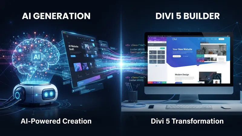
An AI mockup takes four minutes. Turning it into a WordPress site that a client can edit, that works at 390px, and that survives real content takes rather longer — and the gap between those two things is where most AI-to-web projects fall apart.
TL;DR: Don't rebuild the mockup. Extract the system from it — colours, type scale, spacing rhythm, radius, shadow — into Design Variables and presets first, then build sections. Never paste AI HTML into a Code module. Treat AI images as placeholders. And design for content that's 40% longer than the mockup's, because the mockup's copy was written to fit.
What AI Gives You, and What It Doesn't
| AI gives you | It doesn't give you |
|---|---|
| Layout direction and section order | A responsive layout |
| A colour palette that works together | Any CMS connection |
| Type pairings and scale | Anything a client can edit |
| Visual style and mood | Real content |
| Section ideas you wouldn't have had | A design system |
| Sometimes usable HTML | Accessible, semantic markup |
That's not a criticism of the tools. A mockup is supposed to be a mockup. The mistake is treating it as a build spec.
Step 1: Know What Kind of Output You Have
The conversion route depends on what the AI actually produced, and people conflate three very different things:
A static image — Midjourney, DALL·E, most "website design" prompts. You're reading it visually and rebuilding. Colours need picking with an eyedropper; sizes need estimating.
HTML and CSS — ChatGPT, Claude, and most coding assistants. Far more useful than an image, because the values are literal. You can read the exact padding, font-size, border-radius and hex codes rather than guessing. Read it, don't paste it.
A structured design file — Figma with an AI plugin, or a design tool's generative feature. Best case: real layer names, real spacing tokens, real breakpoints.
Divi AI or Quick Sites — worth naming, because it skips this article. Divi's own AI generates actual Divi modules inside the builder rather than an image of a website, and Quick Sites generates a starter site with real Theme Builder templates. If you're starting from scratch rather than converting someone else's mockup, that's a shorter path.
Step 2: Extract the System, Not the Picture
This is the step that separates a maintainable build from a pretty dead end, and it takes twenty minutes.
Go through the mockup and write down:
- Colours. Usually 4–6 real ones, even if the image contains thirty shades. Find the base palette and note which shades are just tints of it.
- Type scale. H1, H2, H3, body, small. If the HTML is available, these are exact. If it's an image, estimate in a ratio — 1.25 or 1.333 between steps covers most designs.
- Spacing rhythm. How much padding do sections have? What's the gap between cards? Nearly every AI design uses about five distinct spacing values, and they're usually multiples of 8 or 10.
- Radius and shadow. One or two radius values, one or two shadow depths. Not eleven.
- Container width. Where does content stop relative to the viewport?
You now have a design system. Everything after this is assembly.
Step 3: Build the Variables Before the Layout
Open the Variable Manager and enter what you just extracted — colours, fonts, numbers for your spacing and radius scale. Use Relative Colors for the tints and shades so they stay linked to their base.
Name them by purpose, not value. Card Background, not Grey 3.
The reason this comes before any building: on a converted design you will be asked to change the palette. It happens on nearly every project, because the client didn't choose the palette — an AI did. A site built on variables absorbs that in ten minutes. A site with hex codes typed into forty modules does not.
Step 4: Build the Presets
The repeated components in the mockup are your presets. In almost every AI design that's:
- Buttons — primary, secondary, and usually a text link style
- Cards — the feature or service card, which is the single most repeated element in AI mockups
- Headings — H1 to H4 defaults
- Sections — the standard padded section and the alternate-background variant
Build these as option group presets where you can — one for the card's border and radius, one for its shadow, one for its padding — so you can recombine them rather than making a new full preset for every variation.
Step 5: Rebuild Section by Section
Now the layout, top to bottom, one section at a time. Header, hero, then each content section, then footer.
Two rules that save the most time:
Match structure before appearance. Get the columns, the stacking and the content order right first. Fine-tuning a shadow on a section whose column structure is about to change is wasted effort.
Use the modern layout tools rather than approximating. AI mockups are full of things that used to need custom CSS and now don't:
- Cards of equal height regardless of copy length → Flexbox Align Items
- Overlapping image and text → the text-overlapping-image techniques
- Masonry or spanning grid items → the visual CSS Grid editor
- Every image cropped to the same shape → Aspect Ratio with Object Fit
- Gradient headline text → Text Fill
That last group is worth checking against your mockup deliberately. AI designs lean on effects that Divi 4 users would have reached for a stylesheet to achieve.
Step 6: Make It Real
The mockup is desktop-only and its content is fictional. Both need fixing before this is a website.
Responsive. Check every section at tablet and 390px. Column stacking, heading sizes, padding that was generous at 1440px and absurd at 390px. Use Display Order to move a CTA above an image on mobile rather than duplicating modules.
Real content. Replace the placeholder copy with the client's actual words — see the opinion below, because this is where converted designs break.
Dynamic content. Any section showing a list of things — blog cards, team members, services, testimonials — should be a Loop Builder query, not six hand-built copies. The mockup shows three cards. The site will have forty.
Images. AI images are placeholders. They come in odd ratios, frequently contain garbled pseudo-text, and carry licensing questions for commercial work. Swap them for real photography or properly licensed stock, then size and compress them — the speed checklist has the numbers.
My Take: AI Mockups Are Designed for Content That Doesn't Exist
Here's my one strong opinion: the reason AI-to-Divi conversions look worse than the mockup isn't your build quality — it's that the mockup's content was generated to fit the layout, and real content never does. Design for 40% more text than you're shown.
I've built over 100 Divi sites and converted a good number of AI designs. The tell is always the same. In the mockup, the hero headline is six perfectly weighted words that break beautifully across two lines. The three feature cards have descriptions of 14, 15 and 14 words. The testimonial is two elegant sentences from "Sarah M., Marketing Director."
Then the real content arrives. The headline is "Comprehensive Financial Planning and Wealth Management Services for Families in Greater Manchester." One feature description is 9 words, another is 61. The testimonial is a paragraph. The client's name is "Dr. Priyanka Balasubramaniam" and it wraps.
The layout didn't fail. It was never tested. AI wrote the copy after deciding the layout, so of course it fits — that's like marking your own homework.
So I build the conversion defensively, and it costs almost nothing:
- Set a
min-heighton card rows, or use Flexbox Align Items Stretch, so a 9-word card doesn't sit shorter than a 61-word one - Test every heading with a string 40% longer than the mockup's before I consider a section done
- Never let a design depend on a specific line break. If the hero only works when the headline breaks after "Financial," it doesn't work
- Check the longest real name, longest real service title, longest real testimonial — actual worst cases from the client's content, not averages
- Assume one image will be portrait when everything in the mockup is landscape. Aspect Ratio plus Object Fit makes that a non-event
The broader point: a mockup is a hypothesis about how content will look, and AI mockups are hypotheses tested against invented data. Your job in the conversion isn't fidelity to the image. It's building the thing the image was gesturing at, in a way that holds when the words are real.
And the honest corollary — sometimes the mockup is wrong and you should say so. AI is very good at generating designs that look like other designs, which means it confidently produces a five-item horizontal nav for a business with eleven services, or a pricing table for a company that quotes bespoke. Converting that faithfully means shipping a usability problem with excellent shadows.
Common Mistakes
Pasting AI HTML into a Code module. It looks like a shortcut and costs you everything: no visual editing, no variables, no presets, no responsive controls, and a client who can't touch it. Read the HTML for its values, then build in modules.
Chasing pixel fidelity. The mockup isn't the deliverable. Nobody will compare them.
Skipping variables because "it's one page." It's never one page.
Shipping AI images. Placeholders. Every time.
Building lists by hand. Three cards in the mockup, forty on the site. Use a loop.
Ignoring accessibility. AI loves low-contrast grey text on white and 13px body copy. Check contrast ratios and set a real minimum body size — this is the most common thing wrong with a generated design and the easiest to fix.
Straight Answers
Can AI build a WordPress site? It builds a mockup. The conversion is the build.
Best conversion method? Extract the design system into variables and presets first, then rebuild section by section.
Paste the AI's HTML into a Code module? No. Read it for values, build with modules.
Use AI images live? Placeholders only — ratios, artefacts and licensing all say no.
How long does it take? 3–6 hours per page once the system exists. Longer for the first page.
Does Divi have AI built in? Yes — Divi AI and Quick Sites both output real modules, which skips the conversion entirely.
The Last Word
AI compressed the concept stage from days to minutes. It did nothing to the implementation stage, which is why the value moved there.
Extract the system, build variables and presets before layout, use Flexbox and Aspect Ratio instead of approximating, and test every section against content 40% longer than the mockup's. That last one is the whole difference between a converted design that holds up and one that looked better as a picture.
Divi 5 is the best bridge I've found between a generated concept and a site someone can actually run, largely because variables and presets give the conversion somewhere structured to land. If you've got a mockup and no appetite for the six hours, send it over — including the version where I tell you the layout won't survive your service list.
Related Reading
- Divi 5 Global Variables: Complete Guide — build this before you build the layout
- Divi 5 Loop Builder — for every section the mockup shows three of
- How Much Does a Divi Freelancer Cost? — what AI-to-Divi conversion work is actually priced at