
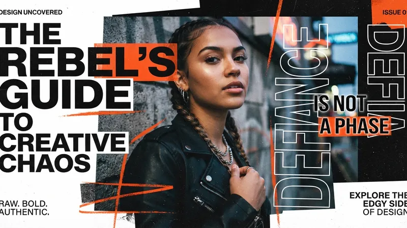
Type that overlaps imagery is one of the oldest tricks in editorial design and one of the easiest to get wrong on the web. Elegant Themes released seven free Divi 5 sections that get it right, and the useful part isn't the download — it's the rules that keep the overlap legible after you've replaced the content.
TL;DR: Import via Divi > Divi Library > Import & Export > Import, add with Add From Library. Overlap is controlled by Design > Sizing, Spacing, Transform and Position. Replace text first, then images, then re-check the layout immediately — copy length changes everything. Pick images with open space and enough contrast for type.
What's in the Pack
Eight JSON files inside divi-5-text-overlapping-image-designs.zip:
- Styled – Text Overlapping Image Section 1 through 7
- Styled – Text Overlapping Image Sections (All) — all seven into the Divi Library at once
Intended for hero sections, portfolio intros, photography sites, creative agencies, service pages, editorial layouts, event pages and product showcases. Divi 5 required. The download is gated behind a newsletter signup — existing subscribers re-enter their email — with a confirmation email step.
Importing and Placing
- Unzip the download.
- Divi > Divi Library → click Import & Export at the top.
- In the Import & Export Layouts modal, open the Import tab.
- Choose File → select the JSON → Import Divi Builder Layouts.
- Open a page in the Visual Builder, add a Section, click Add From Library, pick your section.
Same import route as every other Divi layout JSON, including the free quote sections and the knockout grids.
The Settings That Create Overlap
| Goal | Path |
|---|---|
| Overlap and depth | Section / Row / Column / Group / Image / Text module → Design → Sizing, Spacing, Transform, Position |
| Surface treatment | Same panels → Background, Border, Box Shadow |
| Typography | Text or Heading module → Design → Font, Font Weight, Text Alignment, Text Color, Text Size, Letter Spacing, Line Height |
| Responsive | Divi's responsive controls for text size, image placement, stacking, spacing, overlap behaviour, button placement |
Transform and Position are the two doing the actual overlapping — they lift an element out of normal document flow so it can sit on top of an image instead of beside it. Sizing and Spacing then control how much of the image the text covers.
Replace Text First, Then Check Immediately
The editing order matters more here than in almost any other layout type.
Replace the heading, oversized display text, body copy, buttons, labels, links, service names, captions and CTAs. Then substitute portraits, product photos, background visuals and icons. Work one area at a time so the text-to-image balance survives.
Then re-check the layout the moment you change a headline. Longer or shorter copy rewraps, which shifts balance and changes how the text sits against the image. A three-word placeholder heading replaced with a nine-word real one can push the type straight over your subject's face.
Your correction levers, in the order I'd reach for them: text size, line height, spacing, module width, image position.
To grow or trim a section, duplicate or delete existing rows, columns, groups, image modules, text modules, buttons and content blocks rather than building new ones. That preserves the original structure, spacing and visual rhythm — which is the part of a layout pack you actually can't easily recreate.
Four Rules for Overlapping Type
1. Keep the message legible at a glance. Short headings. If someone has to work to read the overlap, the overlap has failed regardless of how good it looks in a screenshot.
2. Pick the right image. Clear focal point, open space for the type, typography-friendly contrast. The image has to support the text rather than compete with it. Most overlap failures are image-selection failures, not layout failures.
3. Make the overlap deliberate. Tune colour, opacity, spacing, image brightness, overlay strength and placement until the relationship looks intended. Accidental overlap reads as a bug.
4. Build depth with scale and contrast, not with more elements. Scale, contrast, spacing and image placement create the layered look while keeping the section scannable.
Once you've settled a treatment — an overlay strength, a text colour, a shadow behind the type — save it as an option group preset so the next overlapping section matches without you re-deriving the values.
My Take: The Image Decides, Not the Layout
Here's my one strong opinion: overlapping text is a photography decision disguised as a design decision, and treating it as a layout problem is why most attempts look amateur.
I've built over 100 Divi sites and I can predict whether an overlap will work before opening the builder, just by looking at the photo. If there's a quiet region — sky, a wall, shallow-focus background, negative space beside the subject — the overlap will work. If the frame is busy edge to edge, it won't, and no amount of overlay opacity will fix it. You'll just end up with grey text on a grey blur, having destroyed the photo to save the headline.
What people do instead is fight it in the builder. Bump the overlay to 60%. Add a text shadow. Add a semi-transparent panel behind the type. Each step makes it slightly more readable and noticeably worse, and you end up with a design that's technically legible and visually apologetic.
The rule I actually follow: choose the image for the overlap, or choose a layout that doesn't need one. A clean side-by-side of image and text is never embarrassing. A muddy overlap always is.
If the client has supplied a busy photo and won't reshoot, Divi AI's canvas extension can sometimes create the quiet region you need by expanding the frame — that's a legitimate fix rather than a workaround, because you're adding space rather than obscuring content.
Check Mobile Properly
Text wraps and images crop differently on tablet and phone, and overlap is exactly the kind of relationship that survives desktop and dies at 390px. A heading that sits neatly in the top-left quadrant on desktop can end up centred over the subject's face on a phone.
Confirm three things at every breakpoint: text legibility against whatever part of the image ends up behind it, that CTAs stay easy to tap, and that stacking hasn't turned a deliberate overlap into an accidental collision.
Sections using large stacked text, image overlays, portrait cutouts, background photos, split layouts, dark panels or layered blocks need those relationships kept in mind while editing — they're the reason the section reads as designed.
Straight Answers
How do you make text overlap an image in Divi 5? Design tab → Sizing, Spacing, Transform and Position. Transform and Position lift the element out of normal flow.
How do you import these layouts? Divi > Divi Library > Import & Export > Import tab > Choose File > Import Divi Builder Layouts.
Why does changing the heading break the layout? Copy length rewraps and shifts balance. Fix with text size, line height, spacing, module width or image position.
What images work? Clear focal point, open space for type, and enough contrast for legibility.
How do you keep overlapping text readable? Colour, opacity, spacing, image brightness, overlay strength, placement. If it's still hard to read, change the image.
Do these work on mobile? Only if you check. Verify legibility and tap targets at tablet and phone.
The Last Word
Seven free sections that handle the difficult part — the scale and spacing relationships that make overlapping type look editorial rather than accidental.
Import them, replace text before images, re-check after every headline change, and be honest about whether your photo has room for words. That last one saves more designs than any setting in the Design tab.
If you have a great photo and a headline that refuses to sit on it politely, I've solved that particular argument many times.
This is a summary of Elegant Themes' original post, "Text Overlapping Image Designs For Divi 5". All credit for the original content goes to Elegant Themes.