
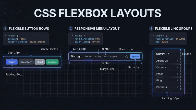
Button groups, breadcrumbs, footer links, nav bars and tag clouds are all the same problem: a row of small items that has to stay tidy when the screen narrows. Divi 5's Flexbox controls solve all five with the same three settings.
Those settings are Layout Style: Flex, direction, and Gap. Everything else is variation.
TL;DR: Set the Column's Layout Style to Flex, Row direction, 10px horizontal and vertical gap, and turn wrapping on. That's a button group, a breadcrumb row or a tag cloud. Footer link groups want a 25% horizontal / 30px vertical gap. Switch to Column direction on phone, not tablet. Use Display Order -1 to pull a CTA earlier on mobile.
Five Patterns and Their Settings
| Pattern | Direction | Gaps | Alignment | Phone |
|---|---|---|---|---|
| Button Group | Row | 10px / 10px | Center | Column, button max 90vw |
| Breadcrumb Row | Row | 10px / 10px | Justify + Align Center | Column, 5px gaps |
| Footer Link Groups | Row, wrap | 25% / 30px | — | 20px gaps, groups align center |
| Header Nav + Buttons | Row | 10px / 10px | Space Between, Align Center | Group 100%, button 80vw |
| Tag Cloud | Row, wrap | 10px / 10px | Justify + Align Center | inherits |
Notice how little variation there is. Four of the five use 10px gaps. The differences are alignment and what happens on phone — which is a good sign that you're using the layout system correctly rather than fighting it.
Building the Button Group
- Select the Column and set Layout Style to Flex.
- Set direction to Row.
- Set Horizontal Gap and Vertical Gap to 10px.
- Enable Wrap so buttons drop to a second line rather than shrinking.
- Set Justify Content to Center.
- At the Phone breakpoint, switch direction to Column.
- On the buttons, set Width and Max Width to 90vw for phone.
That 90vw figure keeps a stacked button from touching the screen edges without you calculating padding. It's the kind of small trick that removes a whole class of mobile bug reports.
Footer Link Groups: The Percentage Gap
Footer columns are the one pattern where a pixel gap is the wrong choice.
- Column Layout Style: Flex, direction Row, Wrap on.
- Horizontal Gap: 25% — a percentage, so it scales with the container.
- Vertical Gap: 30px — fixed, because vertical rhythm shouldn't scale.
- Inside each link group, use a Module Group with a 10px gap between links.
- On phone: reduce gaps to 20px and set the Module Groups to align center.
Horizontal gap in percent, vertical gap in pixels. That mixed approach is deliberate — horizontal space is what runs out first, so let it flex.
Header Nav With a Nested Button Group
The pattern that catches people out, because it's Flexbox inside Flexbox.
- Column: Layout Style Flex, direction Row, 10px / 10px gaps.
- Justify Content: Space Between, Align Items: Center. Logo left, nav right.
- The nested button Group: width 75% desktop, 65% tablet, 100% phone.
- Buttons on phone: 80vw.
The parent handles the big split, the child handles the buttons. Trying to do both from one container is where header layouts go wrong.
For the deeper version of this thinking, Part 9 on responsive columns covers Column Class fractions, and Part 10's best practices covers the mistakes.
Generate the Menu Instead of Building It
This is the best trick in the whole post, and it has nothing to do with Flexbox.
Rather than dropping in a Link module per menu item:
- Add one Link module.
- Enable Loop Element.
- Set Query Type to Menu.
- Set the module's content to the Loop Menu Text dynamic content option.
Divi generates one item per menu entry. Add a page to the WordPress menu and it appears in your nav automatically — no builder edit. Manual Link modules mean editing the layout every time the menu changes, which is a maintenance bill you pay forever.
The full step-by-step build uses: main Row Layout Style Flex, Horizontal Gap 0px, Vertical Gap 5px, Wrap on; Column 1 styled with 15px Border Radius and 10px Padding; then the looping Link module inside.
Same engine as the Loop Builder for dynamic content — the Menu query type is just an underused corner of it.
The Mobile Menu Canvas
For an off-canvas mobile menu:
- Canvas settings: Z-Index 99999 so it sits above everything.
- Section Width and Max Width: 80%.
- Position: Absolute, Offset Origin: Top Center, Vertical Offset: -50px.
- Interactions: Trigger Click, Effect Hide Element, Target the Mobile Menu Section.
The downloadable Menu – Step By Step.json from the original tutorial must be imported through Divi > Divi Library > Import & Export > Import — a Canvas-based layout won't come in any other way.
My Take: Stop Switching to Column on Tablet
Here's my one strong opinion: forcing Flexbox rows into Column direction at the tablet breakpoint is the single most common responsive mistake in Divi, and it's almost always unnecessary.
I've built over 100 Divi sites and I see this constantly. A five-item nav looks slightly tight at 980px, so someone sets direction to Column on tablet. Now an iPad in landscape — 1024px of perfectly usable width — displays a vertical list of five links with an acre of white space either side.
Tablet has more horizontal room than people give it credit for. Let items wrap on tablet. Wrapping uses the width you have and only breaks the line when it genuinely runs out. Column direction throws the width away on purpose.
The sequence: build for desktop, check tablet with wrapping enabled and change nothing, then only switch to Column on phone if wrapping still looks cramped. In practice about a third of the layouts I'd have "fixed" on tablet needed no fix at all.
The related tool worth knowing: Display Order -1. When a CTA sits last on desktop but should come first on mobile, set Display Order to -1 at the phone breakpoint. The element moves ahead of its siblings visually, the markup order stays intact for screen readers and SEO, and you didn't duplicate anything. It's a better answer than the old approach of building two versions and hiding one — which doubles your maintenance and ships both to every visitor.
Straight Answers
How do you build a button group with Flexbox? Column Layout Style Flex, Row direction, 10px gaps, wrap on, Column on phone with buttons at max 90vw.
What gap values work for link rows? 10px horizontal and vertical for buttons, breadcrumbs and tags. Footer groups: 25% horizontal, 30px vertical.
Should rows switch to Column on tablet? Usually not. Let them wrap on tablet; switch to Column on phone only if needed.
How do you move a CTA earlier on mobile? Set Display Order to -1 at the phone breakpoint. Visual order changes, markup order doesn't.
Can you build a nav without manual Link modules? Yes — enable Loop Element on one Link module, set Query Type to Menu, use Loop Menu Text.
How do you import a layout JSON? Divi > Divi Library > Import & Export > Import tab, upload the file, import.
The Last Word
Five patterns, three settings. Layout Style Flex, Row direction, a 10px gap, and wrapping turned on will handle button groups, breadcrumbs, tag clouds and most nav bars without a line of CSS.
Then resist the urge to switch to Column on tablet, and use Display Order rather than duplicate elements. Part 8 of the original series covers using Gaps instead of manual margin, which is the same idea applied to spacing.
Divi 5's Flexbox controls are good enough that most responsive problems are now configuration mistakes rather than limitations. If your nav collapses at the wrong breakpoint and you'd rather not bisect it yourself, I'll bisect it.
This is a summary of Elegant Themes' original post, "Part 7 Of Mastering Flexbox: Building Flexible Button, Menu, And Link Rows". All credit for the original content goes to Elegant Themes.