
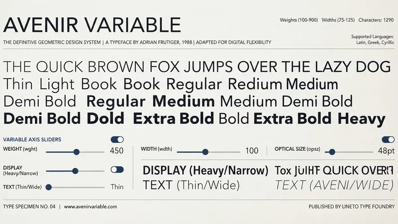
Divi 5's updated Google Fonts integration brings real variable font support: pick a supported font and its axis controls appear in the Design tab wherever that font is applied. One file, a continuous range of styles.
Here are the ten worth using, what each one's axes actually do, and which jobs each is built for.
TL;DR: Inter and Onest for clean UI. Roboto Flex and Recursive when you need many axes. Fraunces, Source Serif 4 and Newsreader for editorial. Bricolage Grotesque and Space Grotesk for expressive headings. Instrument Sans for restrained portfolios. Wire them to font variables in the Variable Manager, not directly to modules.
The Ten Fonts
| Font | Axes | Best for |
|---|---|---|
| Inter | Weight 100–900, Slant | SaaS, dashboards, product UI, documentation, startups |
| Roboto Flex | Weight 100–1000, Width, Optical Size, Slant, Grade, plus parametric axes | Design systems, app interfaces, technical sites, accessible UI |
| Recursive | Weight 300–1000, Slant, Casual, Monospace | Developer tools, documentation, tech portfolios, creative coding |
| Fraunces | Optical Size 9–144, Weight 100–900, Italic, Soft, Wonk | Editorial, food and lifestyle, boutique ecommerce, expressive heroes |
| Source Serif 4 | Weight 200–900, Italic | Blogs, magazines, essays, course sites, long-form |
| Newsreader | Optical Size 6–72, Weight 200–800 | Blogs, editorial, newsletters, publishing, knowledge bases |
| Onest | Weight 100–900 | SaaS, agencies, product pages, portfolios, business sites |
| Bricolage Grotesque | Weight 200–800, Optical Size, Width | Creative agencies, portfolios, bold landing pages, campaigns |
| Space Grotesk | Weight 300–700 | Tech brands, fintech, AI tools, modern landing pages |
| Instrument Sans | Weight 400–700, Italic | Design portfolios, personal brands, clean editorial |
Note the two single-axis entries. Onest and Space Grotesk give you weight and nothing else, and that's a feature — fewer axes means fewer decisions and no possibility of axis sprawl.
What the Axes Actually Do
Registered axes — the five standardised ones: Weight, Width, Slant, Italic, Optical Size.
Custom axes — defined per font:
- Grade (Roboto Flex) — changes density with no width change, so the layout doesn't reflow. Built for hover states, dark sections and dense UI.
- Casual (Recursive) — moves continuously from formal to expressive construction.
- Monospace (Recursive) — proportional through to fixed-width spacing.
- Softness (Fraunces) — rounds edges, shifting crisp editorial toward vintage warmth.
- Wonk (Fraunces) — swaps in irregular alternate forms for select characters only.
- Contrast — the thick-to-thin stroke relationship. High reads editorial, low reads screen-friendly.
- Ascender / Descender length — how open or tight a text block feels.
For most web work, Weight, Width and Optical Size matter most. Everything else is a specific effect for a specific moment.
The distinctions worth having straight: Weight is structural, Grade is density. Optical Size responds to how big the text is; Grade responds to context — hover, dark mode, ambient lighting. Contrast alters the thick/thin gap; Grade is uniform. Casual moves mood continuously; Wonk changes specific letters.
Font-Specific Notes
Inter's Slant is for pull quotes, badges, labels and short emphasis — real angled letterforms rather than a synthetic skew.
Roboto Flex's Grade earns its keep on dark sections. Light text on dark reads heavier than it is; a small negative grade corrects it without reflowing a single line.
Recursive genuinely covers three roles in one file — structured sans, warm expressive, and code-appropriate monospace.
Bricolage Grotesque has two distinct personalities depending on how you combine axes. Lighter and wider gives an airy editorial masthead feel. Heavier and narrower gives dense, punchy headlines.
Instrument Sans maps cleanly: 400 body, 500–600 UI labels and subheads, 700 headings and CTA text.
And the trick that makes variable fonts worth the trouble: use the intermediate values. An H2 at 535 rather than 400 or 700. That half-step was simply unavailable with static fonts, and it's frequently the exact weight a heading wants.
Wire Them to Variables, Not to Modules
The path that scales:
- Open the Variable Manager in the Visual Builder.
- Create or edit a font variable.
- Pick the typeface in the font picker.
- Apply the variable to a text option group and adjust the axes in typography styling.
One font variable for headings, another for body. Then build presets for hero headings, blog titles, product cards, buttons, captions and navigation.
Setting axis values directly on modules works exactly once and then becomes a liability — the same argument as every other value in Divi 5's variable system. For the specific axis numbers I use, seven variable font combinations has copy-paste values for Roboto Flex, Fraunces, Recursive, Inter and more.
Pick by Job
- Clean UI / SaaS — Inter, Onest, Roboto Flex, Instrument Sans
- Editorial — Source Serif 4, Newsreader, Fraunces
- Expressive heroes — Fraunces, Bricolage Grotesque
- Technical / developer — Recursive, Space Grotesk, Roboto Flex
- Ecommerce / product — Inter, Onest, Instrument Sans, Bricolage Grotesque
- One-font systems — Inter, Roboto Flex, Recursive, Newsreader
A solid default pairing: Inter for body and UI labels, Fraunces for editorial hero headings. Swap Fraunces for Bricolage Grotesque if the brand is louder, or drop to Roboto Flex alone if the site is interface-heavy and needs Grade.
My Take: Fewer Axes Is a Feature
Here's my one strong opinion: Roboto Flex is the wrong choice for most sites precisely because it has the most axes.
I've built over 100 Divi sites and I've watched this play out repeatedly. Roboto Flex offers Weight, Width, Optical Size, Slant, Grade and a set of parametric axes for stroke thickness and letter proportions. On a design system with a type specialist maintaining it, that's power. On a client site edited by three people over two years, it's six ways for the typography to drift.
What happens is entirely predictable. Someone widens an H2 slightly because a headline wrapped awkwardly. Someone else adjusts Grade on a section because it looked thin on their monitor. Neither change is wrong. Eighteen months later no two headings share axis values, and the page has a faint wrongness nobody can name.
Onest has one axis. Space Grotesk has one axis. A site built on either cannot drift in that way, because there's nothing to drift. The typography will be less expressive and considerably more likely to still look intentional in two years.
So my actual selection rule is about maintenance, not aesthetics: choose the fewest axes that achieve the design. Reach for Roboto Flex when you genuinely need Grade for dark sections or Optical Size across a wide type scale. Reach for Onest when you need weights. Most sites need weights.
The corollary from the original, which I'd underline: reuse a few deliberate axis values rather than varying them per module. That's the whole discipline, and single-axis fonts enforce it for you.
On Performance
The honest position: one variable file holds an adjustable range, so you get more control without managing a pile of separate font files. That's the real benefit — control and fewer requests.
What nobody has published are load-time figures for these specific fonts. A variable file is larger than a single static weight and smaller than four of them, so the maths favours you at three or more weights and works against you if you truly need one. Most designs need three. Most designers load six.
If you're mid-way through a Divi 5 speed pass, consolidating four static weights into one variable file is a straightforward win. Consolidating a single weight into a variable file is not.
Straight Answers
What are the registered axes? Weight, Width, Slant, Italic, Optical Size. Everything else is font-specific.
Which axes matter most? Weight, Width and Optical Size.
Weight vs Grade? Weight is structural and reflows text. Grade changes density without changing width.
How do you use them in Divi 5? Via the updated Google Fonts integration — pick a variable font and its axes appear in the Design tab.
Best one-font choice? Inter, Roboto Flex, Recursive or Newsreader.
What is Wonk? A Fraunces axis that swaps irregular alternate forms into select characters. Editorial only.
The Last Word
Ten fonts, every axis accounted for. Pick by job, wire them to font variables, build presets for each role, and use intermediate weights — 535 exists now and it's often exactly right.
Then pick the fewest axes that get the design done. That's the choice that determines whether the typography still looks deliberate in two years, and it's the one nobody thinks about while choosing a font.
Divi 5 puts these controls in the Design tab and the Variable Manager. If your site has accumulated eleven weights across four families and you'd like it down to one variable font without anyone noticing, that's a rewarding kind of subtraction.
This is a summary of Elegant Themes' original post, "Best Variable Fonts For Web Design (Now In Divi 5)". All credit for the original content goes to Elegant Themes.